Introduction
Many struggle with starting and maintaining a fitness routine, especially when life gets busy. I wanted to tackle this challenge head-on by creating a solution that allows users to fit their fitness goals into their daily lives, no matter how packed their schedules might be.
That's Fitted, a responsive web app, came to life. Its mission? To make it easier for individuals to find short, effective workouts tailored to their interests and availability. With session times as short as five minutes, Fitted empowers users to maintain a fitness routine, even in a hectic lifestyle.
Over two months, I dove into the project with guidance from CareerFoundry's UX designers course. The goal was clear: create a responsive app with a user-friendly design that could motivate people to stay active, regardless of their available time.
Understanding the User
At the start of the project, I was introduced to a detailed user persona provided in the project brief. This persona became my guiding light. Her name was Rebecca. She was a busy, active professional juggling work and personal commitments, struggling to find time to work out. Rebecca wanted quick, accessible workouts that fit into her unpredictable schedule.
As I worked on Fitted, I continually asked myself: How can I design an app that makes Rebcca's journey easier?
Key features Sarah would need included:
Search and Filter Functionality: To find workouts that suit her needs quickly.
Calendar Integration: To plan sessions when she has time.
User Account Creation: To personalize her experience.
Progress Tracking: To keep her motivated.
Social Sharing: To engage her friends and build community support.
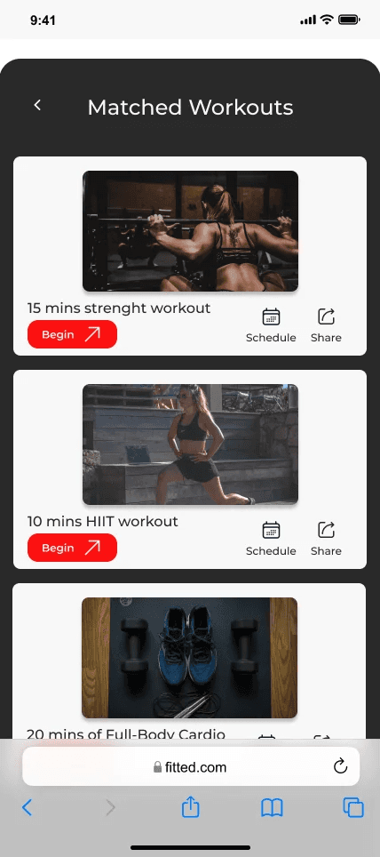
The Design Process
Mapping Rebecca's Journey
The first step in designing Fitted was to map out Rebecca from opening the app to completing a workout. I wanted to ensure that every feature Rebecca needed was present and accessible.
What would interaction be?
How can each screen guide her to her goal?
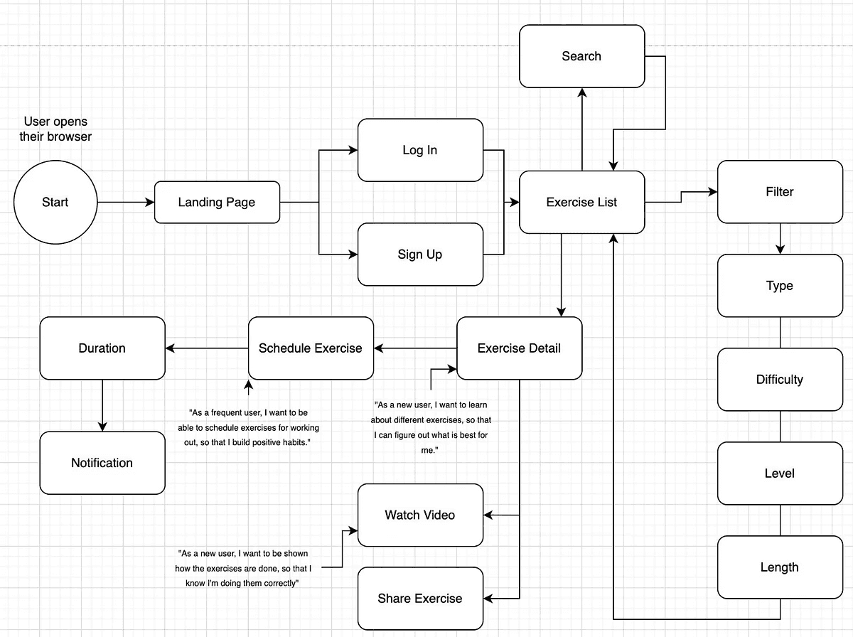
After sketching out a basic user flow, I focused on creating an intuitive layout for each screen. The main dashboard needed to be simple, giving Rebecca quick access to search, filter, and find her ideal workout.
Creating a Seamless Experience
When Rebecca opens Fitted, she's greeted by a clean interface. A hamburger menu simplifies navigation, while a search bar and filter icon help her find what she needs fast. Featured workouts and categories are easy to scroll through, ensuring that Rebecca can quickly find something that excites her—a five-minute core workout or a 20-minute yoga session.
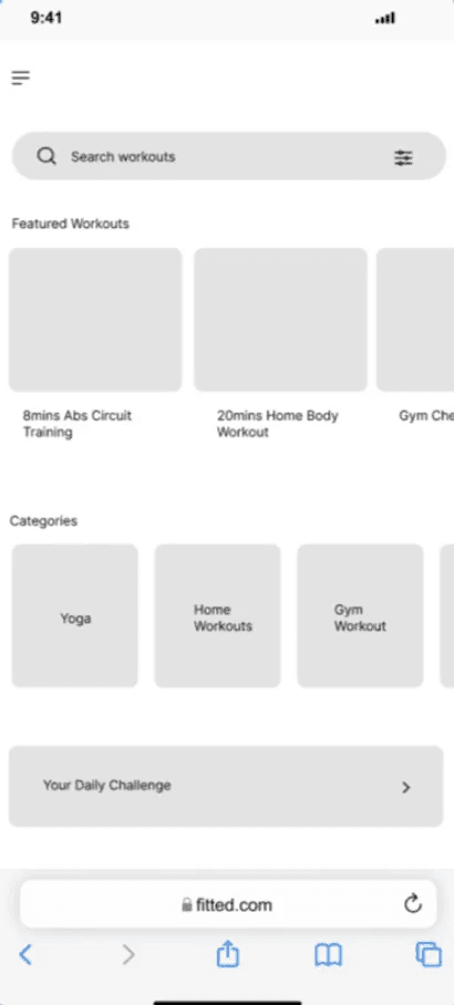
When she selects a workout, the experience remains seamless. The filter screens have a clean layout, simple drop-down bars, a clear CTA (call-to-action) button, and intuitive icons that effortlessly guide Rebecca. A small but essential detail—the escape "X" that ensures that if Rebecca ever needs to backtrack, it's just a click away.

Focusing on UI design patterns
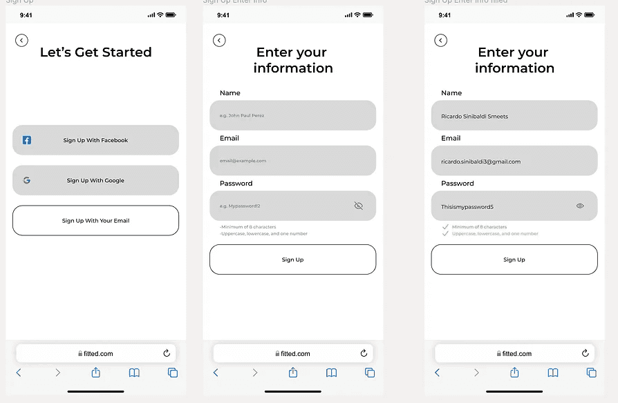
When Rebecca signs up or logs into Fitted, she undergoes an onboarding experience that introduces her to the app. Background images with motivational messages set the tone. Form fields are carefully labeled, and placeholders guide her input, making the process smooth. A small icon next to the password field allows Rebecca to double-check what she's doing, eliminating frustration.
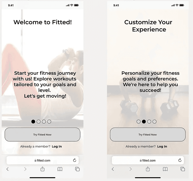
The design features a progress bar so Rebecca always knows where she is in the process, and a skip option lets her jump ahead if she's unsure.

Style Guide: Building Fitted's Visual Identity
To maintain consistency across the app, I developed a detailed style guide that covers typography, color schemes, and UI elements.
Typography: I chose Montserrat for its clean, modern look and strong readability, which are essential for users quickly scanning through the app.
Colors: The color palette features energizing shades of red and contrasting tones of gray for a sense of balance. The red tones symbolize energy and motivation, while the gray tones support readability and accessibility.
Fitted'Fitted's had to work seamlessly across devices, so I adopted a mobile-first approach. Starting with mobile layouts allowed me to focus on core functionalities, ensuring that scaling up to tablets and desktops would be straightforward. The result? A consistent user experience, no matter what device Rebecca uses.
Explore the complete style guide here: Fitted Style Guide.

Mockups and Prototype
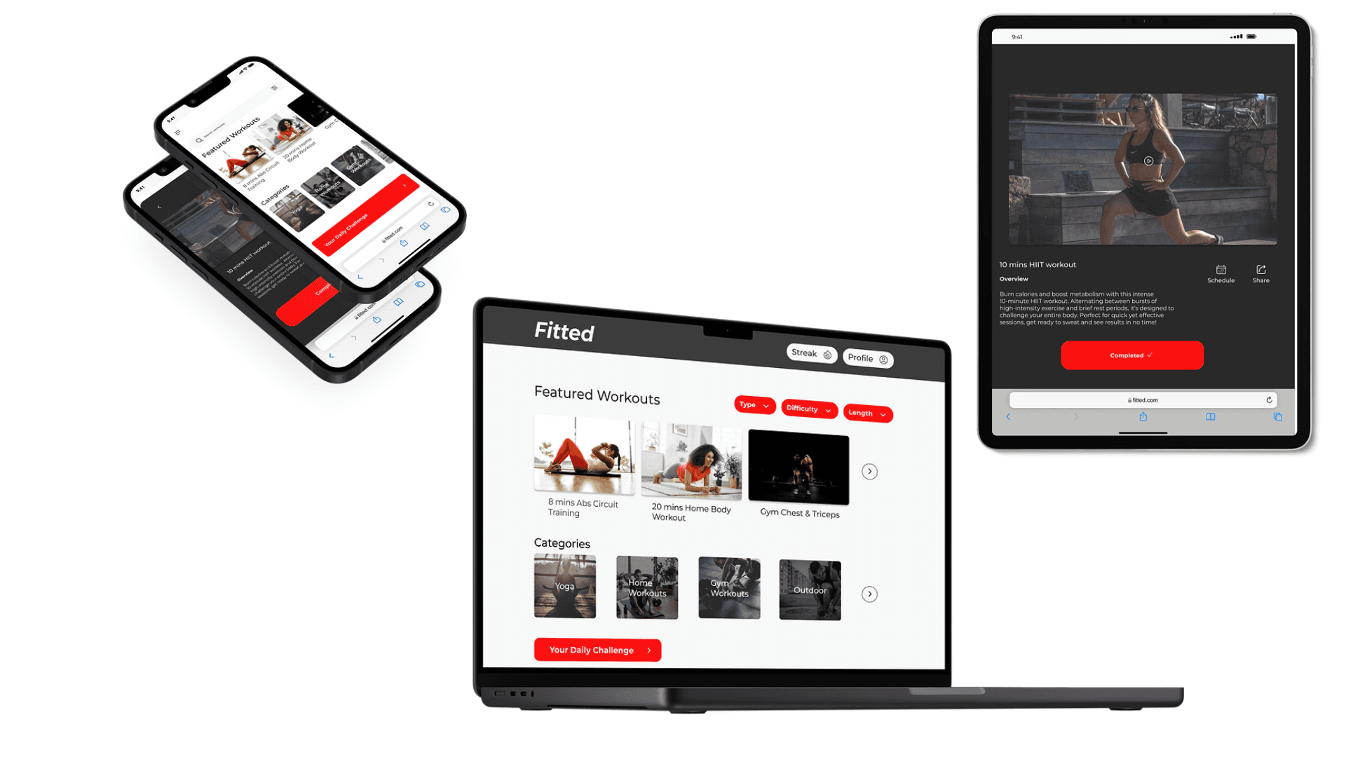
Mockups and Prototype
Designing Fitted required careful thought about usability, but the ultimate goal was seeing it in action. You can view the mockups and explore the Figma prototype here: Figma Prototype.
Conclusion
Designing Fitted wasn't about creating a visually appealing app. It was about solving real user problems—making fitness accessible, motivating, and easy to integrate into a busy lifestyle. The project reinforced my understanding of UI design principles, from creating visually cohesive interfaces to ensuring usability through every step of the user journey.
Reflections
Throughout the project, I grew significantly as a designer. But looking back, there are a few things I'd do differently next time:
Incorporate More User Testing: While I focused heavily on UI patterns and flows, gathering real-world feedback earlier in the design process could have led to more user-driven decisions.
Accessibility Focus: Though I ensured the app was accessible, in future projects, I would pay even closer attention to the fine details of accessibility guidelines, ensuring the app is usable for everyone.
Performance Considerations: It's easy to get carried away with visuals, but optimizing the app for faster load times would enhance the overall user experience, particularly on mobile devices.
Lessons Learned
Consistency is Key: Maintaining a cohesive design language across all screens dramatically improves user experience.
User-Centric Design: Keeping Rebecca's at the forefront helped ensure every feature and interaction served a purpose.
Iterative Design Process: Design is never truly finished. Iterating based on feedback is critical to creating a user-friendly product.
Cross-Device Compatibility: Starting with a mobile-first approach ensured that transitions to larger screens felt natural and seamless.
In future projects, I'll continue to apply these lessons, refining my process and pushing for more innovative, user-friendly designs.


