Introduction
Managing finances in today’s fast-paced digital world should be seamless. But many users struggle between apps—one for transactions, another for budgeting, and none that fully prioritize a smooth, secure, and intuitive experience. Enter MoniX, my first UX/UI design project. MoniX offers users a one-stop solution for seamless financial transactions while allowing them to establish and track their monthly budgets, all within a beautifully designed mobile app.
How everything was done
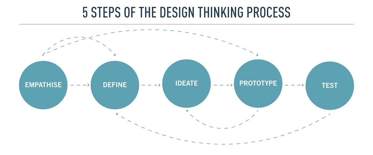
image adapted from Career Foundry
This project was my hands-on introduction to the design thinking process, where I tackled every step: user research, low-fidelity wireframes, and polished high-fidelity prototypes. As a budding UI/UX designer, MoniX marked the beginning of my journey, giving me invaluable experience and insight.
Initial Goals ✍️
The Problem
Many financial management apps on the market either excel at ease of transactions or offer solid budgeting features, but rarely both. Users are left switching between platforms, making managing their finances inefficient and fragmented. Additionally, many existing solutions lack the aesthetics and intuitive designs that encourage consistent use.
My Solution 💭
MoniX aims to bridge this gap. It combines secure, seamless financial transactions with intuitive budgeting tools—all wrapped in an aesthetically pleasing, user-friendly interface. The goal? To help users track their spending and manage their finances without hassle.
Research Process & Results 🔬
Methodology
I started the project by conducting user surveys and user interviews to uncover user behaviors, preferences, and pain points related to financial apps. Thirteen participants completed surveys online through Google Forms, and five more were interviewed in person. This research helped me pinpoint the common challenges users face when managing their finances digitally.
Research Goals
I wanted to understand how people manage their finances digitally, what features they value in financial apps, and what pain points need addressing.
User Survey Questions
Addressed topics such as online shopping frequency
Comfort with digital finance management
Preferences for app features
Feedback on existing financial apps.
User Interview Questions
Explored users' experiences with financial apps
Challenges faced
Features they liked
Suggestions for improvements include asking open-ended questions and getting data conversationally.
Results & Takeways
Security First: While most participants felt comfortable with digital financial management, they had significant security concerns. Building trust through robust security features would be crucial for MoniX.
Key Features: Participants emphasized the need for budgeting tools, transaction history, and ease of use. These insights informed the core functionalities of MoniX.
Fast & Transparent: Users wanted fast payments, clear fees, and smooth navigation. MoniX needed to be intuitive and efficient, meeting these user expectations.
User Personas 👤
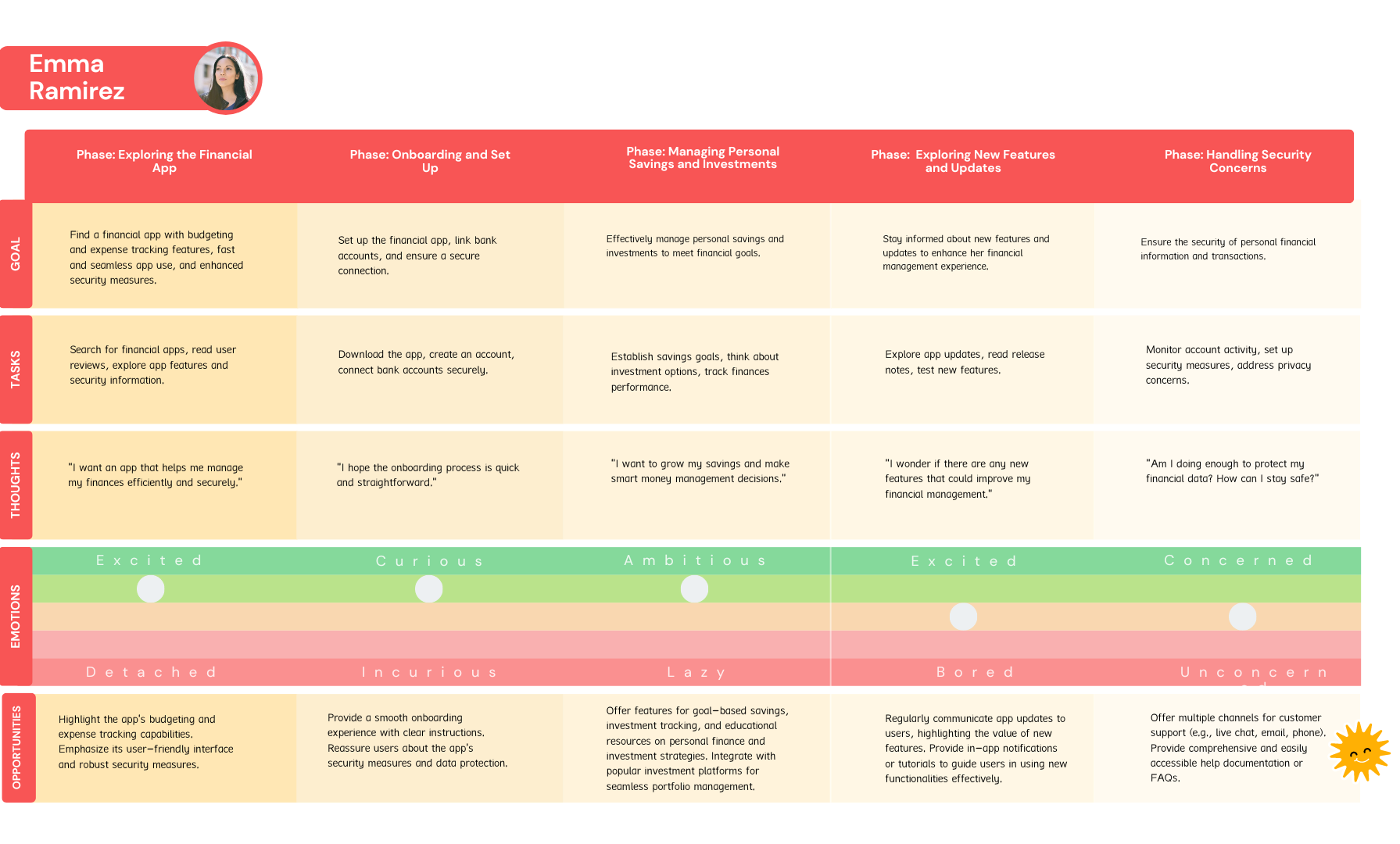
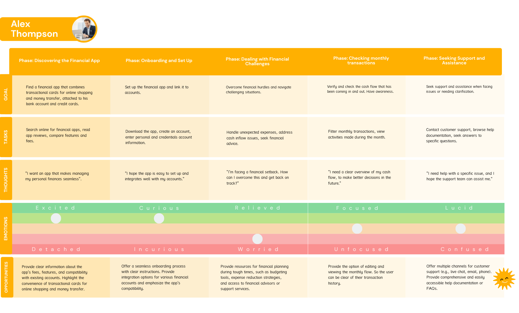
The following personas represent the critical insights from participants of the user surveys and interviews.
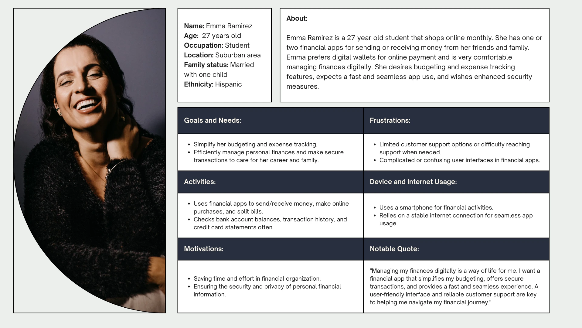
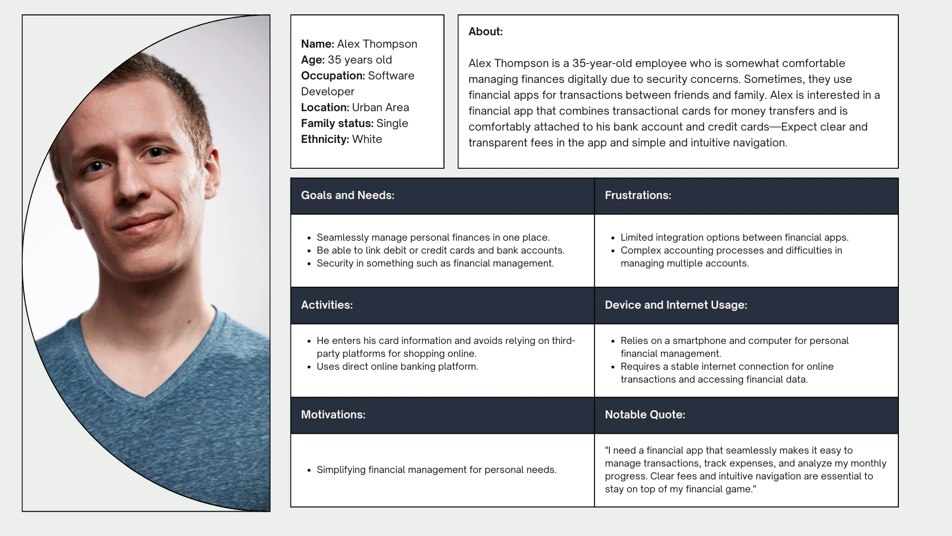
To have a structured framework and have understanding, identifying pain points, opportunities for innovation, and alignment with user needs:
I came up with these user journey maps
⬇️
From Research to Design
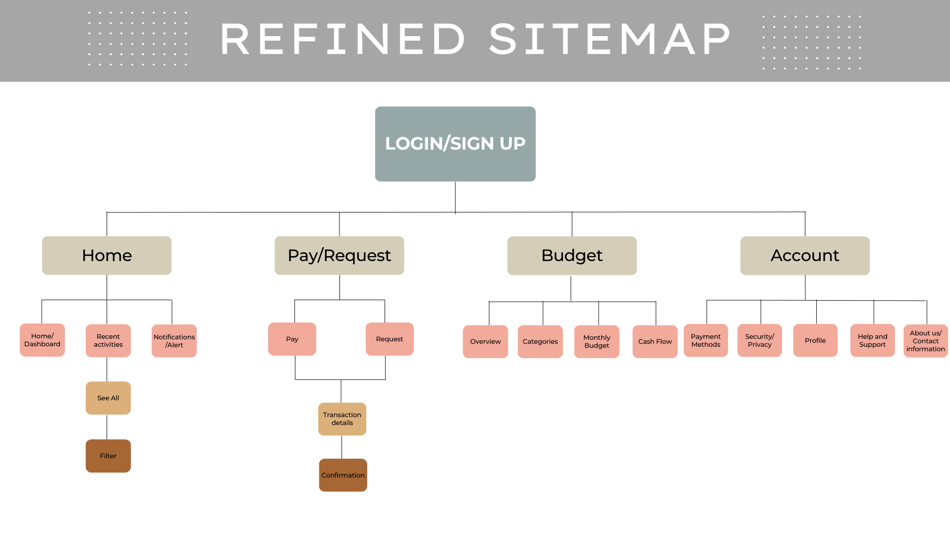
Card Sorting & Information Architecture
To structure MoniX’s information architecture, I ran a digital card sorting test using OptimalSort involving eight participants. They were presented with various financial categories and asked to organize them logically. This helped me refine the sitemap, improve the app's layout, and ensure users could navigate intuitively.
Prototyping: From Low to High Fidelity

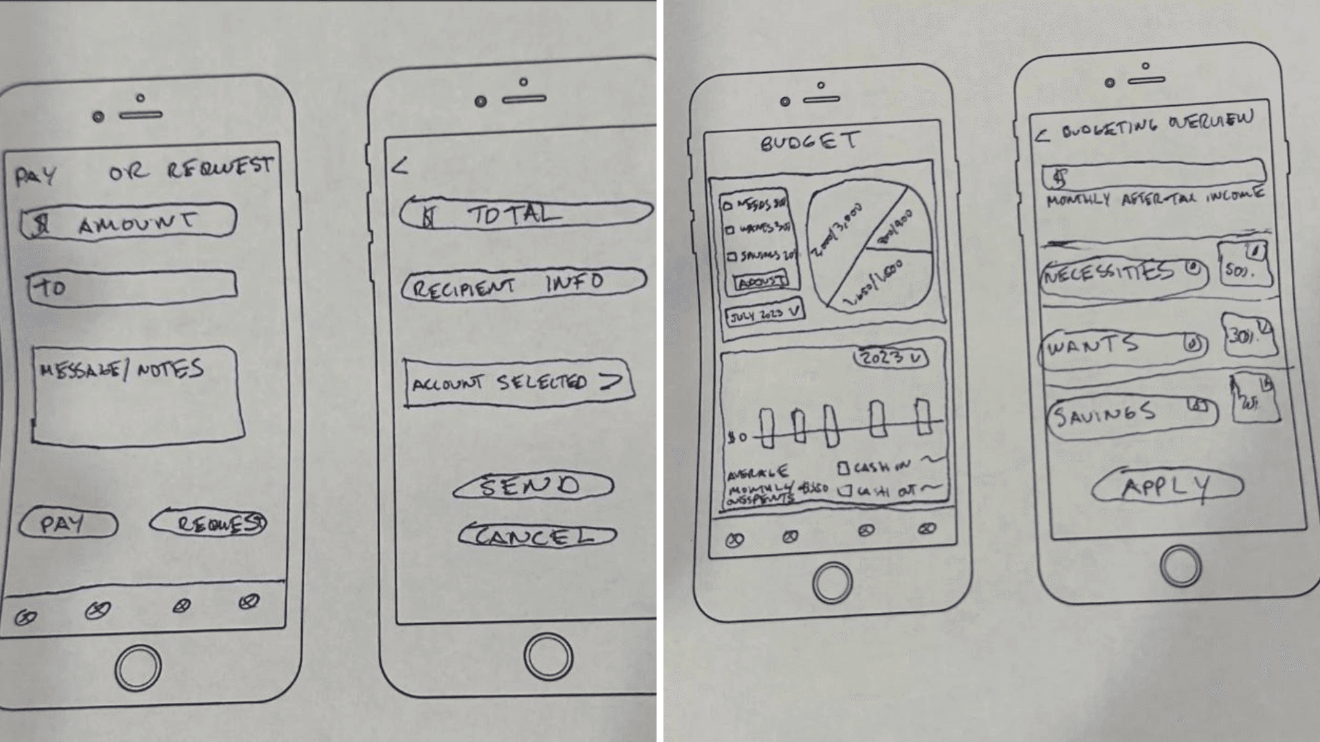
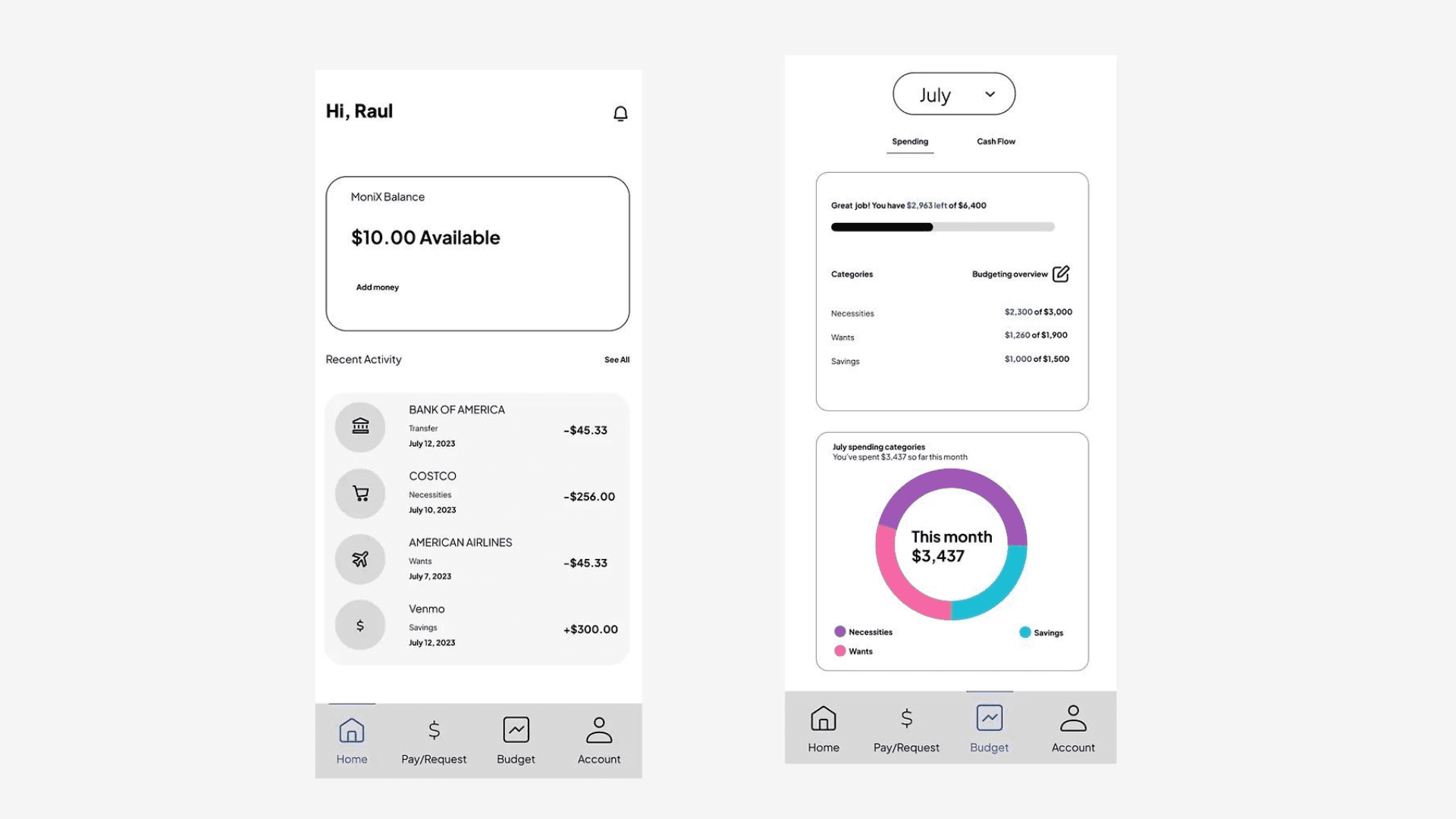
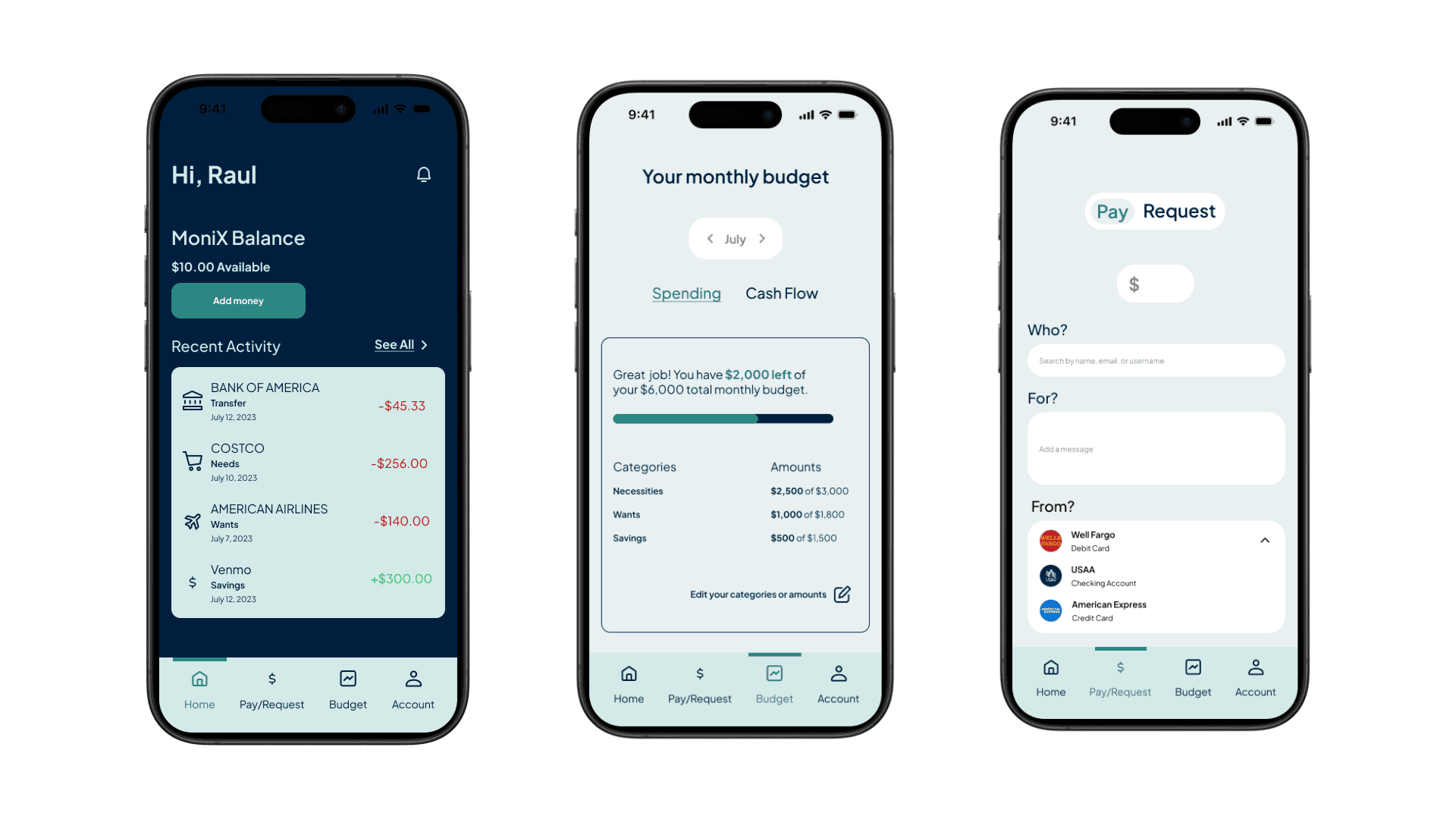
Starting with low-fidelity wireframes, I focused on essential functions: primary navigation, key pages like transaction history and budgeting, and user-friendly buttons. The aim was to visualize the app’s skeleton before moving on to mid-fidelity prototypes, where I refined the UI and began testing basic interactivity. Finally, the high-fidelity prototypes captured the polished look and feel of MoniX, focusing on details like color schemes, spacing, and precise placement of elements.
Low-Fidelity
Mid-Fidelity
High Fidelity
Usability Testing: Observing Real Users

Goal:
I wanted to see how real users interacted with MoniX, observe their behaviors, and identify areas for improvement.
Methodology:
I conducted usability tests with five participants, each lasting 10-15 minutes. Using an iPhone, I recorded users’ interactions with the app while noting their reactions and feedback.
Key Findings & Changes:
Issue 1: The “back” button wasn’t working (High).
Change: Fixed the functionality and retested to ensure it was intuitive.Issue 2: Participants struggled with the flow when selecting the amount, recipient, and message before making a transaction (Medium).
Change: I added clear labels and placeholders in the form fields to guide users better.Issue 3: Budget graphs were confusing (Medium).
Change: I adjusted the opacity for unselected months, clarified the legend, and added a top bar highlighting the current month.Issue 4: The tab bar didn’t remain fixed when scrolling (Low).
Change: Fixed the tab bar’s position to improve navigation.Issue 5: Users were unsure how to filter and view all transactions (Medium).
Change: Improved the layout by grouping related items and adjusting text size for more straightforward navigation.
UI Design & Final Solutions
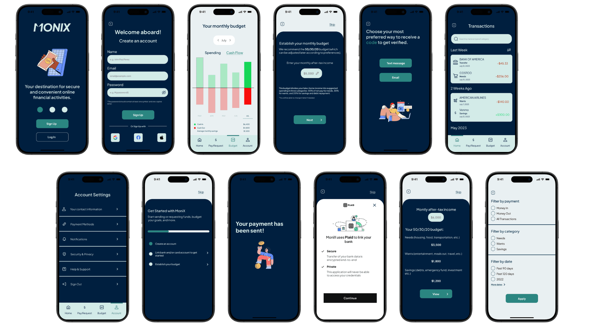
After implementing the changes from the usability testing, I designed the final high-fidelity screens using Figma. The design emphasizes:
Smooth Onboarding: A frictionless signup and login process.
Enhanced Security: Reinforced encryption and security measures.
Streamlined Budget Tracking: Clear graphs and summaries of monthly spending.
User-Friendly Transactions: The ability to easily send or request funds from friends or family.
Consistency & Accessibility: A clean, accessible design for all users.
UI Design Principles such as Gestalt psychology and consistent visual hierarchy were central to the design process. I also created a detailed style guide to ensure the design remained cohesive across all screens and future iterations.
Final Prototype
Are you curious to explore MoniX yourself? Check out the final prototype: MoniX Prototype on Figma
Conclusion
MoniX marked a significant step in my journey as a UI/UX designer. It allowed me to explore the entire design process, from research to high-fidelity prototypes. The final product meets the core goals of creating a secure, user-friendly financial app that seamlessly helps users manage their budgets and transactions. This project challenged me to grow my usability, visual design, and user-centered problem-solving skills.
Next Steps
To further refine MoniX, I would incorporate additional user feedback from diverse demographics to ensure broader accessibility and functionality. Expanding the app’s features, such as integrating AI for personalized budgeting advice, could also enhance its value. Finally, ongoing user testing will help to improve the user experience continually.
Lessons Learned
This project taught me the importance of adaptability and iteration in design. I learned to balance user needs with technical constraints and realized the value of thorough usability testing to uncover hidden issues. Most importantly, I gained confidence in applying UI/UX principles to create intuitive and visually appealing designs.


